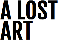
Remember when we used to pass notes in grade school? We sketched our best friend’s name or I love so and so or acronyms for every new and made up phrase (lylas, ttyl, bffe) all over sheets of blue-lined notebook paper, folded it into some indistinct shape and passed it from desk to desk hoping not to get caught by Mr. Smith. We’d communicate in style, glitter pens on paper in bubbled or graffiti letters, saying just as much with the fonts we created than with the words themselves. It’s a lost art. A friend of mine who teaches middle schoolers confirmed that when she told me her students no longer pass notes to each other but texts and emails instead. Where’s the craft in that? Where’s the personality? Where’s the paper folding expertise?
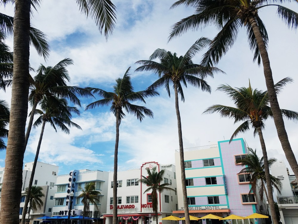


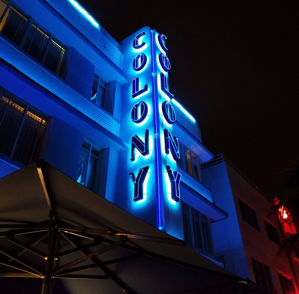
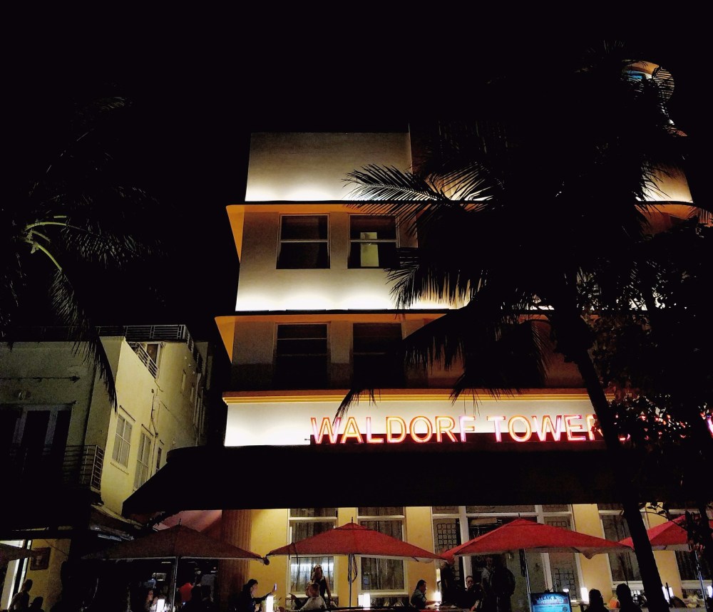
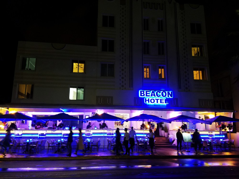
What does this have to do with my trip to Miami? I stayed in a hostel in South Beach, home to the Art Deco District. This style represented art turned fashion in the early 1930s and is characterized by simple, clean geometric shapes with bold curves and a streamlined look that gave a nod to the inherent design qualities of machine-made objects. Think The Great Gatsby meets the Chrysler Building in 1920s Paris (where the style derived). You can view it in architecture, fashion, jewelry, furniture, figural sculpting, and, of course, typography. This is exactly what I experienced in South Beach: beautifully curved corners with bold colors placed in linear form, and shadows cast strategically by the sun in the day and spotlights at night and fonts that screamed “retro!”
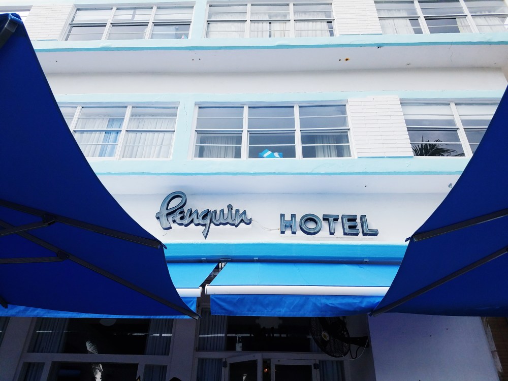

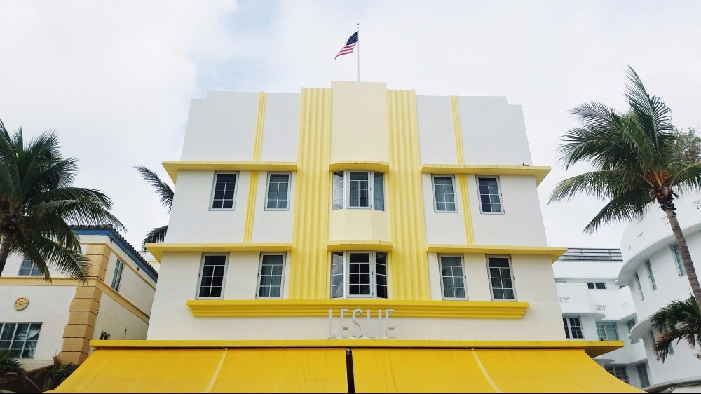

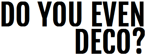
Seeing Art Deco in South Beach was refreshing. It rekindled my love of typography. I didn’t truly recognize this until I walked through a strip of common American chains in Miami Beach seeing the logotypes for Walgreens, McDonald’s and PetSmart. They came off as commonplace and uninventive, maybe too familiar? That’s where the Art Deco hotels and restaurants stole the show. They communicated something a little different, like “Hey, look at me I’m sophisticated and classy and ish” versus “Hey, look at me I’m your favorite global megachain.” A similar message with a bit more gusto.

Seeing this out in the wild reminded me of how much I loved communicating with fonts in handwritten grade school notes (and eventually what I found so intriguing about the field of advertising). To me, it’s the beauty of how something is communicated, using one font versus another, this color instead of that, soft textures instead of hard, etc. It gives off a completely different tone and almost begs to be interacted with in a different way too. Passing notes in the forbidden red ink, gel pen, or with Crayola marker was the first way I learned to craft a message by design. Although I consider this a lost art, maybe kids today are finding their own way to craft a message via text and email. Yes, GIFs and emojis and thousands of fonts are at their fingertips but how much more momentous to have a paper trail and typography that symbolizes you at a specific time in life? I think I’ll start passing handwritten notes again.

November 2017
Where should I go next? Perhaps Lisbon.
© Copyright 2017 Akua Sencherey. All rights reserved.
